
 Regina Wang
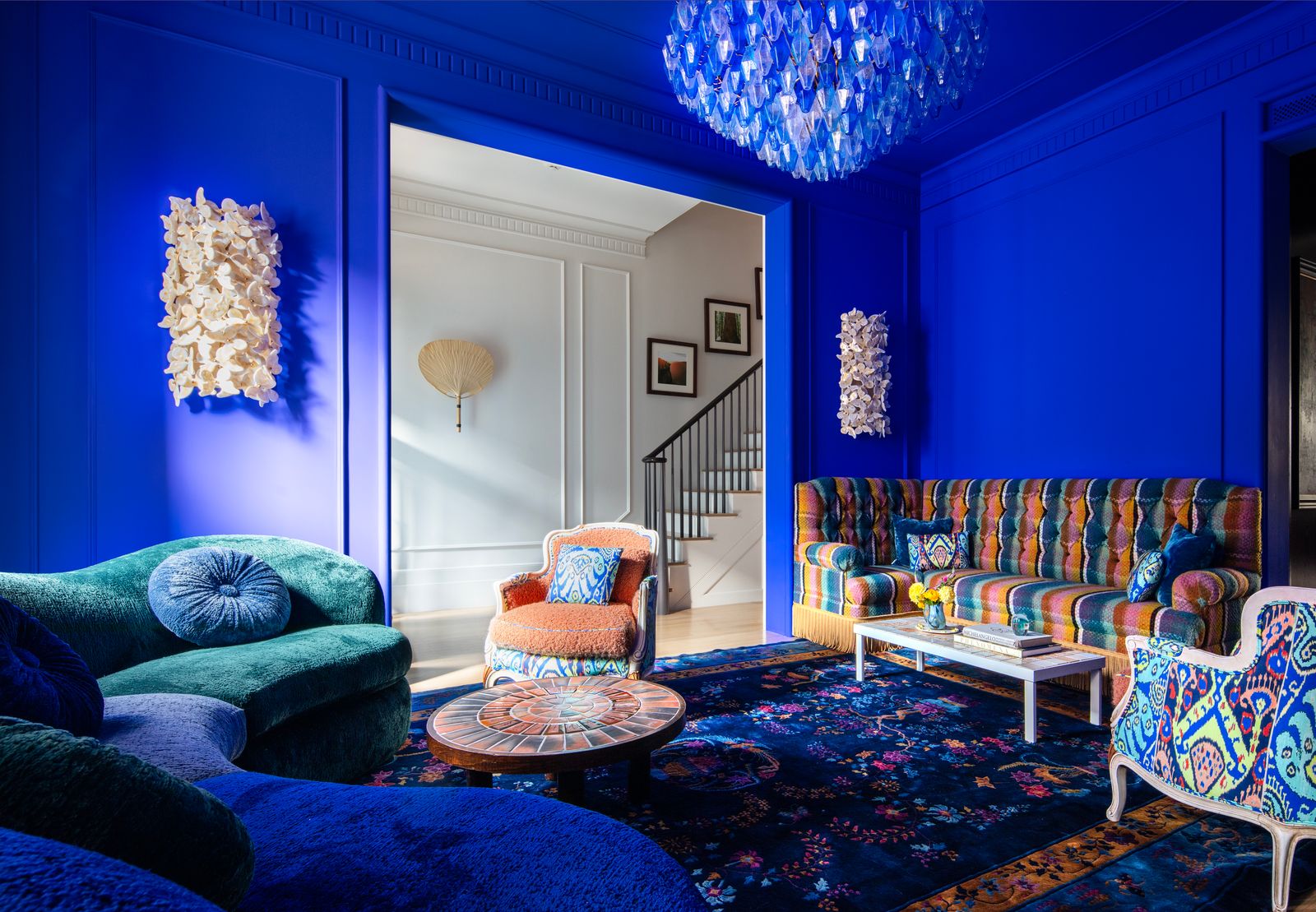
Let’s be honest: minimalism has had its moment. All that beige and white can feel, well, a bit quiet. A bit safe. If your soul craves more—more energy, more personality, more pure, unadulterated joy—then maximalist color theory is your new best friend. This isn’t about throwing every color at the wall and hoping it sticks. It’s a deliberate, riotous strategy for creating spaces that feel alive.
Think of it like a symphony, not a single note. It’s layered, complex, and thrilling when done right. Ready to ditch the fear and paint with confidence? Let’s dive into the vibrant world of bold interior color.
What is Maximalist Color Theory, Really?
Forget the “less is more” mantra. Maximalism champions “more is more.” But—and this is a crucial but—it’s “more with intention.” Maximalist color theory is the framework that keeps a bold interior from tipping into chaos. It’s the set of principles that help you combine saturated hues, contrasting tones, and diverse patterns in a way that feels curated, not cluttered.
It’s about emotional resonance. A deep emerald green might feel lush and library-esque, while a punchy tangerine screams playful energy. The theory helps you harness those feelings deliberately.
The Core Principles: It’s Not Just “Pick All The Colors”
Okay, so here’s the deal. To master bold interior design with color, you need a few guiding lights. These aren’t rigid rules, more like friendly suggestions from someone who’s been in the paint aisle panic.
- Embrace the Color Wheel (But Have Fun With It): Complementary colors (opposites on the wheel) create dynamic energy. Think a sapphire blue sofa against a terracotta wall. Analogous colors (neighbors on the wheel) offer rich, harmonious depth—like magenta, plum, and burgundy.
- Play with Saturation and Value: Not every color needs to be neon-bright. Mix saturated “hero” colors with muted tones or deeper shades. A bright citron yellow pops even more against a backdrop of charcoal gray and olive green.
- The 60-30-10 “Rule” is a Starting Point: In maximalism, these percentages can get… flexible. But it’s a useful anchor. 60% dominant color (walls, large rug), 30% secondary color (upholstery, curtains), 10% accent (throw pillows, art). In a maximalist space, that 10% might be five different accent colors, and that’s perfectly fine.
- Texture is Color’s Best Friend: Color changes with texture. A glossy fuchsia on a lamp base is different than a velvety fuchsia on a cushion. The light catches it differently. Layering textures adds complexity that lets you use more color comfortably.
Building Your Maximalist Color Palette: A Practical Approach
Starting is the hardest part. You look at a blank wall and imagine a mistake that’s a whole weekend to repaint. I get it. So don’t start with the wall. Start with an inspiration piece. It could be a wild piece of fabric, a painting you adore, or even a favorite ceramic mug. Pull three to five core colors from that item.
Now, build out from there. Add a metallic—brass or chrome isn’t a cop-out, it’s a neutral in this game. Then, consider a “bridge” color, something that ties two contrasting hues together. If your palette has electric blue and hot pink, a touch of violet can bridge them beautifully.
| Palette Vibe | Core Color Combo | Mood & Tip |
| Jewel Box | Emerald, Amethyst, Sapphire, Gold | Opulent, dramatic. Use in rooms with good natural or artificial light to make the gems sparkle. |
| Sun-Drenched | Terracotta, Ochre, Turquoise, White | Warm, global, inviting. Ground brights with earthy tones and natural materials like rattan. |
| Electric Eclectic | Magenta, Lime, Cobalt, Black | High-energy, modern. Using black (on trim, furniture) defines and sharpens the brights. |
Pattern Clashing: The Advanced Move
This is where maximalist color theory really sings. Pattern mixing is basically color theory in action. The key to clashing patterns successfully? Vary the scale and share a color thread. A large-scale floral with pink and green can work with a tiny geometric check in the same pink, if you introduce a solid green velvet pillow to bridge them. It’s a balancing act, but when it clicks, it’s pure magic.
Common Pitfalls (And How to Sidestep Them)
Look, even experts—or, you know, enthusiastic amateurs—hit snags. Here are a few pain points in bold interior design and how to fix them.
- The “Visual Noise” Overload: If the room feels hectic, your eye doesn’t know where to rest. Solution: Add a visual breather. A large, solid-colored rug. A simple, dark wood floor. Matte black picture frames. These elements give the eye a place to pause.
- The Rainbow Vomit Effect: When every color fights for top billing. Solution: Choose a dominant hue. Let one color lead (even if it’s a bold one), and use the others in supporting roles.
- Ignoring Lighting: Color is a trickster under different lights. That perfect peachy-coral can look muddy at night. Solution: Always, always test paint and fabric samples in the room at different times of day. Use warm-toned bulbs to enrich reds, oranges, and yellows; cooler bulbs can make blues and greens pop.
Let’s Talk Trends: Maximalism Now
Today’s maximalism isn’t your grandmother’s heavy, dark Victorian look. It’s fresher, often lighter. There’s a big trend towards “organic maximalism”—mixing those bold colors with loads of plants, natural wood tones, and curved, soft furniture shapes. It feels vibrant but lived-in, not stiff.
Another trend? Monochromatic maximalism. Sounds like an oxymoron, right? But imagine a room washed in every shade of blue, from ceiling to floor. The maximalism comes in the layering of textures, patterns, and tones within that single color family. It’s a powerful, immersive approach.
Conclusion: Your Home, Your Canvas
At its heart, maximalist color theory is about permission. Permission to embrace what you genuinely love, without apology. It’s a rejection of the notion that sophistication means neutrality. A bold interior isn’t just a style choice; it’s a mood lifter, a conversation starter, a daily dose of dopamine.
So start small if you need to. Paint the inside of your bookshelves a shocking pink. Hang a riotously colored tapestry. Pair two pillows that “shouldn’t” go together. The goal isn’t a perfect, magazine-ready shot—it’s a space that, when you walk into it, feels undeniably, joyfully you. And honestly, that’s the only theory that truly matters in the end.